FOLLOW ON INSTAGRAM!

WE ARE HOUSE OF SMICHI ❤

POPULAR POSTS

Showing posts with label color. Show all posts

December 17, 2016

Color Therapy: Greenery Overdose

Greetings!
This week Color Therapy session has still celebrated the chosen of Greenery colors as Pantone Color of the Year 2017. Start a new year with fresh mind and soul to do great things ahead!


HoS color scheme of the week has taken from one of the greenery in front of my house. As you can see, inspirations come from anywhere, as long as you want to widen your view.
Now, let's talk about the colors!

This week color scheme is a little bit different from last week's Greenery color scheme. This week we have a full serene color scheme by the lead of bluish green colors. They are (the shades names from left to right):
Basil
Pear
Mint
Frost
Not all the greenery has the same colors, sometimes they surprise us with another beautiful colors that we can't imagine.

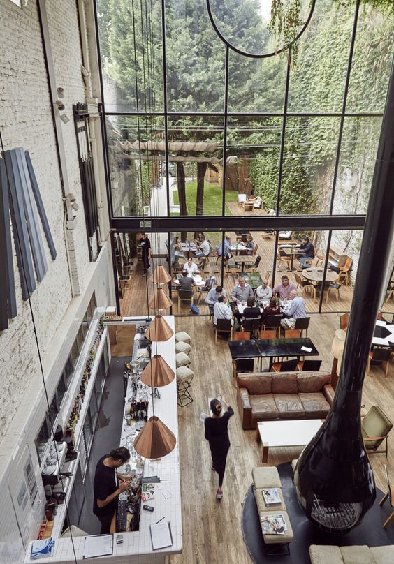
Basically all green has an illustration of growth and fresh ambiance. It defines the rejuvenation and revitalization the best. That's why usually, hospitals use green as one of the dominant color. Green also makes us want to reconnect with the nature to purify our minds and soul so we can have clear mind to set the future.

Let's feel it in some of these pictures I took with the color scheme.


Already have a thought about how you change your personal space's look next year? Perhaps green can help you a little wiser to let your inner beauty out.

That's all for today. We'll see you all again soon!
Thank you for reading!

Remember,
think interior design, think House of Smichi!

December 10, 2016

Color Therapy: Greenery Color Scheme

Greetings! ❤
Today we celebrate Greenery as the color scheme of the year by Pantone. And it's the right time to talk about the color scheme from the Greenery inspirations that I captured yesterday on my way to the train station.


Greenery has been refresh our life up to now because the color can make us reconnect with the nature once again. It revitalizes and rejuvenate our minds and soul and make them clear as we seek the need of the fresh air and the fulfilled life. The color illustrate the growth and desire to do something good. Greenery grows along with the brown of the soil and the colorful flowers, so we can say, greenery is the main color of the earth.

Pine
Like a pine tree leaves, it gives us calmness and clean our minds to let us feel the breeze among the hard wind blows. It also gives us the feelings of fertility to grow bigger and healthier. Although it's a dark color in greenery shades, but this color can give a gradient into our lives to remember that everything is under control.

Fern
The Fern color is one of the cheerful color in green shades. The color reminds us to keep reconnect with the nature and take care of everything that lives. It also can reduce bad emotions because it gives a feelings of happiness from the inside. 

Lime
Although it's more yellow than the green, but Lime can give you Lime Squash that is so refreshing and relieve the thirst. It also gives you the feelings of bittersweet of life that you must face it in positive way. Lime also can cheer you up and make you stay young and stay inspired because it cleans the negativity.

Lemon
This one is part of the Yellow family that leaves a wonderful gradient from our inspiration of greenery this week. Lemon is a cheerful and playful color that makes you no longer feel sadness and heartache. But don't make it too much or you can't rest your mind at all. The brightness of the color brings you so much energy to living the life.

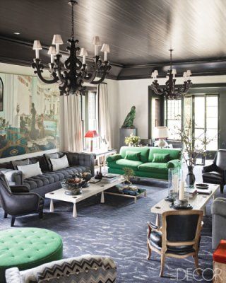
Let's see the greenery entered the interior spaces.


That's all for today. We'll see you all again soon!
Thank you for reading!

Remember,
think interior design, think House of Smichi!

October 29, 2016

Color Therapy: Swimming Pool Color Scheme

Greetings!
When I think about swimming pool, I always think of freshness of summer and coziness of laying under the sun at the side of the pool, reading a favorite book. And this time, this swimming pool in one of the apartment in Jakarta, is my source of inspiration for Color Therapy session today.


Let's talk about the colors!

Taupe
Taupe is one of the brown color family. It needs more brown and a little bit grey to make a Taupe. Taupe reminds us about earthy feelings and cooling down. It neutralize all the bad emotions and going into a deeper thinking. Sometimes the Taupe relates to one of Zen's colors that can bring a relaxation ambiance.

Walnut
Walnut color brings the sweetness of life and pleasure. The color also brings a security and responsibility into a family and friendship. This color serves a comfort, like home, with delicious foods, but keep it in a simple way but in a warm greetings. Sometimes walnut color relates to chocolate color that turns down the nerves inside of a stressful day.

Blue Sky
Reminds us of gratitude and wisdom that life can give. Blue sky can brings us honesty and trust. And blue sky can reduce stress because blue sky relates to a peaceful mind that blue sky can give. Like if we look up to the sky, blue sky can make you feel so relax and safe.

Aquamarine
Aquamarine is more white of the blue. Reminds us of the shallow sea water, brings us a peaceful and tranquil ambiance, but fun in the same time. Sometimes this color and its shades used in a beach cottage to let us stay in comfort and quiet ambiance, to let the freedom fill the soul.

Here are some interior inspirations we found on Pinterest. Enjoy!


That's all for today. We'll see you all again soon!
Thank you for reading!

Remember,
think interior design, think House of Smichi!

October 22, 2016

Color Therapy: Afternoon Sky Color Scheme

Greetings!
Colors of the day is a view which I took from some times ago when the sky looked sooo beautiful in orange and purple combination.


Now let's talk about the colors!

Tangerine
First we have Tangerine color that sometimes this color related to Autumn color scheme because it reminds us about the pumpkin's color shades. Tangerine is basically washed orange color which brings cheerfulness and coziness at the same time. Tangerine color always reminds us about the falling leaves during Autumn, beautiful and amazing.

Black
Black represents the silhouette of the houses in the picture. Black can make everything so calm but depressed if you use too much black because it gives you dark mood and creepy feelings. Black also represents the power and control because when there is Black, it usually makes every bright colors surround it becoming darker.

Mauve
Mauve is one of the purple colors family. It has more blue and a bit red in combination. This color represents a mysterious ambiance. It's a good color for daydreaming and give emotional feelings for the user. The color is also allowing us to get a deeper thoughts and get some introspective from the inside of our soul.

Grape
Grape color is more red than blue in purple shades. Like a grape fruit, this color can give us the sweetness and good memories that we experience so far. It also reminds us about gratitude for all what we have. Grape color is rather happier than any purple colors because its joyful feelings about our life now.

Today's color scheme is fit for your Autumn decor if you decided to decorate your house during this season. Here are some inspirations that we got from Pinterest. Enjoy!


That's all for today's Color Therapy session. We'll see you all again soon!
Thank you for reading!

Remember,
think interior design, think House of Smichi!

October 8, 2016

Color Therapy: Scandinavian Inspired Color Scheme

Greetings!
Today's Color Therapy session inspired by the Scandinavian style. We've been into it lately for some reasons. First, we have an upcoming interior kiosk project in hospital which the owner really loves about clean and simple look. Second, we were taking a break to take a visit to IKEA store. So, yeah, we've inspired a lot by the style! :D


Let's talk about the color scheme of the week.

Black
Black is one of the neutral color that the darkest color in color spectrum. People who loves black that much rather have a good protection of themselves and mysterious. Black hides lights and blocks all the external things into inside. But black is not all about the negativity. In fashion industry, black can make your body slimmer and thinner. It's all about the illusion of the black color can give. Not only that, we need blackout when we are sleeping to release the Serotonin that makes us sleep well at night. Black also gives a sense of power and control like the Greek mythology used for Hades.

White
White is the opposite of black. It's a lightest color in color spectrum and has a pure and clean ambiance whenever we use it. So that, most of the wedding decor has white as a symbol of purity of a new life chapter. White is about perfection and completion. White also related into the beginning of a creativity, like a blank canvas. It is a base to starting something. Most of the gods in every mythology, even Jesus Christ, always be drawn in white clothes. White brings light and hope.

Caramel
It's a brown family member which so sweet and gives a mood booster. Caramel color is rather a natural color related to wooden texture or soil. Caramel has a lighter brown that brings you comfort and honesty. Whenever you need extra sugar boost, just add the caramel!

Charcoal
Basically it's a dark grey color. It's a compromising color since it's between white and black. It can give you stress relief of outside matters. But charcoal can give you stability and control. But too much grey can make you depressed and sad. So you must add another color to balance the ambiance.

We've found some interior inspirations from Pinterest for some cafe at some place. Enjoy!


That's all for today. We'll see you all again on another session of Color Therapy on House of Smichi!
Thank you for reading!

Remember,
think interior design, think House of Smichi!

October 1, 2016

Color Therapy: Green Wall Color Ideas

Greetings!
Hello October and happy weekend everyone! Today we've got inspiration of color from the green wall outside the Mandarin Oriental Hotel in Jakarta.


Today's color scheme idea reminds us about the rainy season we have here in Indonesia. Where all the greenery becomes greener, while the sky mostly cloudy and gloomy, waiting for the rain falling down. The colors bring us into calming and serene ambiance.

Let's talk about each colors!

Parrot Green
First we have what we called Parrot Green color from the greenery palette. The color is a little bit soft but still strong. It brings us the coolness and natural color into the space. It also brings you a brightness soul to clean the energy and make you peaceful. It will tell us to grow bigger and better.

Lime Green
Lime Green is yellowish green from the greenery palette. The color brings you freshness and energetic feelings. But doesn't like lime, the color will give you sweet memories about a space because you can feel so cozy and alive inside the room. It brings you positive vibes and a new spirit to continue life.

Cloud Grey
Although most grey colors brings you a gloomy feelings, but this Cloud Grey can give you brightness yet calmness into the room. The color consists much white than the grey color that will bring your neutral and quiet space. The color is good for you who wants to have a hideaway place around the house.

Grey
Basically grey is an unemotional color. But sometimes grey can neutralize the bright colors inside the room. Too much grey can make you feel so depressed because it's dark and gloomy. But grey can be solid rock and stable. And it's a color of maturity and responsibility. And grey also can brings you an elegant and formal vibes into the space.

Here are some gallery that we're taken from the Pinterest. Enjoy!


That's all for this week's Color Therapy session! We'll see you all again soon!
Thank you for healing with us!

Remember,
think interior design, think House of Smichi!

September 24, 2016

Color Therapy: Autumn Colors Ideas

Greetings!
It's autumn already in four seasons countries. In here, we have rainy season which more gloomy but still fun. Because rather than thinking all the gloomy things, we decided to do and make something.

Well, anyway, today we have re-arranged our Color Therapy session in a new package. Still talking about the colors, but we take the colors ideas from the view we see everyday. Like today, we have taken one view in Jakarta Kota Station in Jakarta, that reminds us about autumn colors.
This is our color of the day.


Let's talk about the colors!

Baby Blue 
First we have baby blue which we take from the color of the sky. It's a part of the pastel colors in color scheme. But the blue color often use as one of the neutral colors if there's one or more bold colors in the space. It brings the calmness and peaceful ambiance for the space.

Tangerine
Second color we have is tangerine. It's not a bright orange color, but a little bit calm orange that still friendly with the autumn season ambiance. In here we choose the pastel color of tangerine. Tangerine can bring you a freshness of the room while it gives you the sweetness of life.

Beige
Sometimes beige can replace white as a bright neutral colors in the space. Beige is a combination of much white with a little bit brown color. Beige color often used in a Zen room theme because of the its serenity ambiance and also some people said that this color can clean the bad energy.

Taupe
Taupe color is combination of grey and much brown. It brings you the natural color into the space. It fits perfectly with beige as the bright color, while taupe is a little bit darker. Taupe will reminds you to give a little thankful for today's blessings because it reminds you of soil and sand color that can give you peaceful mind.

Here are the applied color scheme into an interior design that we took from Pinterest.


That's all for today. We'll see you all again soon!
Thank you for reading!

Remember,
think interior design, think House of Smichi!

CONTACT US!

Feel free to contact us by drop comments
or
email us to: houseofsmichi@gmail.com

You can ask, share, discuss, or just talk about art and design with us! :)

POPULAR POSTS