FOLLOW ON INSTAGRAM!

WE ARE HOUSE OF SMICHI ❤

POPULAR POSTS

Showing posts with label Pantone. Show all posts

December 17, 2016

Color Therapy: Greenery Overdose

Greetings!
This week Color Therapy session has still celebrated the chosen of Greenery colors as Pantone Color of the Year 2017. Start a new year with fresh mind and soul to do great things ahead!


HoS color scheme of the week has taken from one of the greenery in front of my house. As you can see, inspirations come from anywhere, as long as you want to widen your view.
Now, let's talk about the colors!

This week color scheme is a little bit different from last week's Greenery color scheme. This week we have a full serene color scheme by the lead of bluish green colors. They are (the shades names from left to right):
Basil
Pear
Mint
Frost
Not all the greenery has the same colors, sometimes they surprise us with another beautiful colors that we can't imagine.

Basically all green has an illustration of growth and fresh ambiance. It defines the rejuvenation and revitalization the best. That's why usually, hospitals use green as one of the dominant color. Green also makes us want to reconnect with the nature to purify our minds and soul so we can have clear mind to set the future.

Let's feel it in some of these pictures I took with the color scheme.


Already have a thought about how you change your personal space's look next year? Perhaps green can help you a little wiser to let your inner beauty out.

That's all for today. We'll see you all again soon!
Thank you for reading!

Remember,
think interior design, think House of Smichi!

December 10, 2016

Color Therapy: Greenery Color Scheme

Greetings! ❤
Today we celebrate Greenery as the color scheme of the year by Pantone. And it's the right time to talk about the color scheme from the Greenery inspirations that I captured yesterday on my way to the train station.


Greenery has been refresh our life up to now because the color can make us reconnect with the nature once again. It revitalizes and rejuvenate our minds and soul and make them clear as we seek the need of the fresh air and the fulfilled life. The color illustrate the growth and desire to do something good. Greenery grows along with the brown of the soil and the colorful flowers, so we can say, greenery is the main color of the earth.

Pine
Like a pine tree leaves, it gives us calmness and clean our minds to let us feel the breeze among the hard wind blows. It also gives us the feelings of fertility to grow bigger and healthier. Although it's a dark color in greenery shades, but this color can give a gradient into our lives to remember that everything is under control.

Fern
The Fern color is one of the cheerful color in green shades. The color reminds us to keep reconnect with the nature and take care of everything that lives. It also can reduce bad emotions because it gives a feelings of happiness from the inside. 

Lime
Although it's more yellow than the green, but Lime can give you Lime Squash that is so refreshing and relieve the thirst. It also gives you the feelings of bittersweet of life that you must face it in positive way. Lime also can cheer you up and make you stay young and stay inspired because it cleans the negativity.

Lemon
This one is part of the Yellow family that leaves a wonderful gradient from our inspiration of greenery this week. Lemon is a cheerful and playful color that makes you no longer feel sadness and heartache. But don't make it too much or you can't rest your mind at all. The brightness of the color brings you so much energy to living the life.

Let's see the greenery entered the interior spaces.


That's all for today. We'll see you all again soon!
Thank you for reading!

Remember,
think interior design, think House of Smichi!

December 6, 2014

Color Therapy: Red Apples from Our Fridge

Welcome back to another Color Therapy session with House of Smichi in Christmas edition!

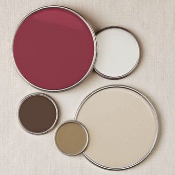
We are celebrating the chosen of the color of the year 2015 by Pantone today, Marsala. Basically Marsala is the red wine color. The color is full with passion, very elegant, and so classic.
You can read the the whole post about the Pantone's Color of the Year 2015 here.


Marsala is a color between red and purple. The color is similar to Burgundy, the darker red-purplish color, and Maroon, a red-bluish color.

The color RED MARSALA is suitable to use in a dining room or kitchen because of its appetite feeling. Mix the color with light wood color or white color to balance the heaviness of it.


When you put this color into a living room, it will be a very elegant and sophisticated room you've ever met. You can get a classic look by combines RED MARSALA with darker colors like black, grey, or dark brown.


And you will get a modern touch by combines it with lighter color like white or beige.


You can mix RED MARSALA with another light colors like yellow or aquamarine. Here are some color combinations for you.


See you on another session of Color Therapy still in Christmas Edition.

Remember.
Think interior design, think House of Smichi! 

xoxo,

January 12, 2014

Pantone Color 2014: Radiant Orchid


Say hello to Radiant Orchid color for 2014!

"Radiant Orchid blooms with confidence and magical warmth that intrigues the eye and sparks the imagination. It's an expressive, creative, and embracing purple - one that draws you in with its beguiling charm. A captivating of fuchsia, purple, and pink undertones, Radiant Orchid emanates great joy, love, and health."


I feel the warmth, richness, and beautiful everytime I see this color of the year. If you raise an orchid (or more) you'll know why. This color brings you peaceful state of mind and relaxing mode. 


You can mix Radiant Orchid colors with green, white, and turquoise, and even with black color too. It fits with the combinations of earthy colors too. In interior design field, with shades of warm shade of lighting, the color looks perfect. You can use it as dominant color or just an accent. Play with neutral colors.


Here's the range of the color.


Or you can bring this pastel colors into your things.


Radiant Orchid is also great for outdoor too! Make it rustic or bold theme.


Play with your color and make it beautiful! You can play with your wall covers with painting or wallpaper, or you just put it simply enough as you use the fabrics for the pillows and cushions. Welcome, Radiant Orchid!

P.S.: Credits to all the owner of all pictures I used. :)

Think interior design, think...

CONTACT US!

Feel free to contact us by drop comments
or
email us to: houseofsmichi@gmail.com

You can ask, share, discuss, or just talk about art and design with us! :)

POPULAR POSTS